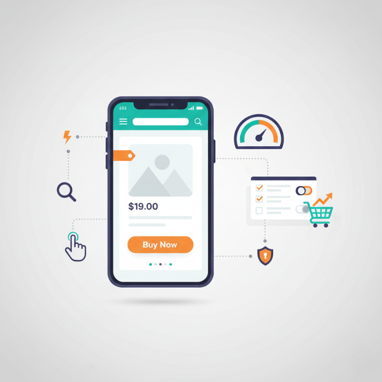
Mobile commerce isn’t the future it’s the present. More than 70% of e-commerce traffic now comes from mobile devices, and that percentage continues growing annually. For Shopify stores, mobile optimization isn’t optional; it’s essential for survival in increasingly mobile-first markets.
Yet many Shopify store owners still treat mobile as an afterthought. They design for desktop, then hope their stores work adequately on phones. This approach fails because mobile shopping isn’t just desktop shopping on smaller screens it’s fundamentally different with unique behaviors, constraints, and opportunities.
Mobile shoppers have different contexts than desktop shoppers. They browse while commuting, waiting in lines, or relaxing on couches. They use thumbs instead of mice. They face smaller screens, potentially slower connections, and more distractions. Shopping experiences that work well on desktop often frustrate on mobile.
The good news is that Shopify provides solid mobile foundations. All modern Shopify themes are responsive, automatically adapting to different screen sizes. However, truly optimized mobile commerce requires going beyond responsive design to specifically consider mobile user behaviors, optimize performance aggressively, streamline mobile checkout, and leverage mobile-specific features.
After optimizing hundreds of Shopify stores for mobile commerce and analyzing mobile performance data across various industries, we’ve identified what actually improves mobile conversion rates versus what sounds good but doesn’t move metrics. This guide covers practical, proven mobile optimization strategies that increase mobile sales.
Why Mobile Optimization Matters for Your Bottom Line
Understanding mobile’s impact on business helps prioritize optimization efforts and justify investment.
Mobile traffic dominates e-commerce, typically accounting for 60-80% of traffic for most Shopify stores. If your store performs poorly on mobile, you’re frustrating the majority of your visitors.
Mobile conversion rates historically lagged desktop significantly mobile visitors converted at roughly half the rate of desktop visitors. However, well-optimized mobile experiences now convert nearly as well as desktop, sometimes better for certain product categories.
Mobile-first indexing from Google means your mobile site’s performance affects search rankings for all users. Slow or poorly functioning mobile sites rank worse even in desktop search results.
Page speed correlation with conversion rates is direct and measurable. Research consistently shows that improving load times from 3 seconds to 1 second can increase conversion rates by 20-30%. Every second of delay costs conversions.
Mobile cart abandonment rates exceed 85% industry-wide higher than desktop abandonment. Mobile-optimized checkout experiences substantially reduce abandonment, directly increasing revenue.
Competitive disadvantage from poor mobile performance sends customers to competitors with better mobile experiences. In markets where mobile optimization varies, well-optimized stores capture disproportionate market share.
Customer lifetime value might be affected by first mobile experience. Frustrated first-time mobile shoppers might never return, while positive mobile experiences encourage repeat purchases.
Brand perception suffers when mobile experiences are subpar. Slow, confusing, or frustrating mobile sites make brands appear unprofessional or outdated regardless of product quality.
Mobile optimization directly affects revenue, making it among the highest-ROI improvements for most e-commerce businesses.
Mobile Shopping Behavior: Understanding Your Mobile Customers
Optimizing for mobile requires understanding how mobile shopping differs from desktop shopping.
Shorter sessions characterize mobile browsing. Mobile visitors typically spend less time per session but visit more frequently. Mobile optimization should facilitate quick browsing and enable easy returns to continue shopping later.
Higher bounce rates on mobile reflect both lower commitment (easier to click away) and lower tolerance for poor experiences. First impressions matter enormously slow loads or confusing navigation trigger immediate bounces.
Thumb-based navigation replaces mouse cursors. Elements need to be large enough for thumb taps (minimum 44×44 pixels) with adequate spacing preventing misclicks. Bottom-screen elements are easier to reach than top-screen elements.
Portrait orientation dominates mobile browsing despite some users occasionally rotating to landscape. Design primarily for portrait orientation where most usage occurs.
Context differences mean mobile shoppers often browse casually during commutes, TV commercials, or downtime with partial attention and easy distraction. Capture interest quickly before attention shifts.
Research-then-buy patterns are common where users research on mobile but complete purchases on desktop where they feel more secure entering payment information. Seamless cross-device experiences that let users save carts or email themselves product links facilitate this behavior.
Impulse purchases happen more frequently on mobile for certain product categories. Quick, frictionless checkout enables impulse buying before users change their minds.
Visual dominance is even stronger on mobile where text is harder to read. Images, videos, and visual cues communicate more effectively than text-heavy product descriptions.
Understanding these behavioral patterns helps prioritize which mobile optimizations will impact conversion rates most significantly.
Mobile Speed: The Foundation of Mobile Optimization
Speed is the single most important factor in mobile optimization. Slow mobile sites frustrate users and kill conversions regardless of how good everything else is.
Target speed metrics should aim for under 3 seconds for complete page loads, under 1 second for Largest Contentful Paint (when main content appears), and under 100 milliseconds for First Input Delay (responsiveness to interactions).
Image optimization dramatically impacts mobile speed because images typically account for 50-70% of page weight. Compress images aggressively mobile screens don’t need full desktop resolution. Use WebP format when possible (70-80% smaller than equivalent JPEG quality). Implement lazy loading so offscreen images don’t load until users scroll toward them.
Minimize app usage because each Shopify app adds JavaScript, CSS, and potential external requests. Audit installed apps and remove anything not essential. Remaining apps should load asynchronously rather than blocking page rendering.
Reduce redirects because each redirect adds network round-trips and delays. Ensure product URLs, collection URLs, and navigation links go directly to destinations without intermediate redirects.
Enable compression through Shopify’s built-in GZIP compression ensuring text resources (HTML, CSS, JavaScript) transmit compressed for faster downloads.
Leverage browser caching so returning visitors don’t re-download unchanged resources. Shopify handles caching automatically for assets, but ensure your theme sets appropriate cache headers.
Minimize third-party scripts from analytics, advertising, chat widgets, and other services. Each third-party script adds requests to external servers, slowing pages and creating dependencies on external performance.
Code minification removes unnecessary characters from CSS and JavaScript without changing functionality, reducing file sizes by 20-40% or more.
Critical CSS inlines styles needed for above-the-fold content directly in HTML, letting below-the-fold CSS load asynchronously. This technique makes pages appear to load faster even if total load times remain similar.
Test on real devices using actual mobile devices over cellular connections, not just desktop browsers with mobile simulators. Real-world mobile performance often differs substantially from desktop simulations.
Monitor Core Web Vitals through Google Search Console and PageSpeed Insights tracking Largest Contentful Paint, First Input Delay, and Cumulative Layout Shift Google’s official metrics affecting search rankings.
Professional Shopify development services include comprehensive performance optimization ensuring stores load quickly on mobile devices.
Mobile Navigation: Making Products Easy to Find
Navigation that works on desktop often fails on mobile where screen space is limited and interaction patterns differ.
Hamburger menus are standard for mobile navigation but should be clearly labeled with “Menu” text, not just an icon. Test whether your target audience understands hamburger icons older demographics sometimes don’t recognize them.
Sticky navigation bars keep menus and search accessible as users scroll, reducing the need to scroll back to top for navigation. Sticky headers should be minimal (logo, menu, cart, search) to avoid consuming excessive screen space.
Search prominence is critical because mobile navigation is more cumbersome than desktop. Make search easily accessible preferably visible without opening menus. Auto-complete and suggested searches help users find products quickly.
Category hierarchy should be shallow aim for 3 levels maximum from homepage to product. Deep navigation hierarchies frustrate mobile users who must tap multiple times to reach products.
Mega menus popular on desktop don’t translate well to mobile. Use accordion-style menus showing categories and subcategories progressively rather than trying to display everything simultaneously.
Bottom navigation bars for primary actions (Home, Search, Cart, Account) leverage thumb-friendly bottom-screen areas. Consider bottom navigation for stores where these actions are frequent.
Breadcrumbs help users understand location within site hierarchy and navigate back up levels without starting over. Breadcrumbs are especially valuable on mobile where navigation is less visible.
Filters and sorting for product collections need mobile-optimized interfaces. Full-screen filter panels work better than sidebar filters that consume precious horizontal space.
Quick navigation to popular categories or bestsellers from homepage helps users find products quickly without exploring full navigation hierarchies.
Mobile Product Pages: Converting Browsers to Buyers
Product pages are where purchase decisions happen. Mobile-optimized product pages remove friction from those decisions.
Large product images should be prominent and tappable to full-screen views. Mobile users can’t see fine details in small images, so make it easy to view products closely.
Image galleries should be swipeable rather than requiring taps on thumbnail images. Swipe interactions feel natural on mobile and are faster than tapping small thumbnails.
Image zoom functionality lets users see product details clearly. Pinch-to-zoom should work smoothly, or implement tap-to-zoom showing enlarged product views.
Product videos engage mobile users effectively and communicate product features efficiently. Short videos (15-30 seconds) showcasing products in use convert better than long videos most users won’t watch completely.
Above-the-fold content should include product image, title, price, and add-to-cart button without scrolling. Users should be able to purchase immediately if they’re ready without scrolling for key information.
Concise descriptions work better on mobile than lengthy text. Lead with key benefits in 2-3 sentences, then provide additional details in expandable sections for users wanting more information.
Expandable sections for descriptions, specifications, shipping info, and reviews keep pages scannable while making detailed information available. Accordion-style expanding panels work well.
Trust signals like security badges, return policies, and customer reviews should be visible without excessive scrolling. Mobile users are more hesitant about mobile purchases, so addressing concerns upfront improves conversion.
Prominent calls-to-action with large “Add to Cart” buttons (minimum 44px tall) in contrasting colors make purchasing easy. Sticky add-to-cart buttons remaining visible while scrolling ensure the button is always accessible.
Size and variant selectors should be large, clearly labeled, and easy to use. Small dropdown menus are frustrating on mobile use larger buttons or visual swatches when possible.
Quantity selectors might default to 1 with clear increase/decrease buttons rather than requiring typing quantities on mobile keyboards.
Social proof through customer reviews, ratings, and user-generated photos builds confidence on mobile where users can’t physically examine products. Feature reviews prominently on product pages.
Mobile Checkout Optimization: Reducing Cart Abandonment
Checkout is where mobile’s highest friction occurs. Optimizing mobile checkout directly reduces the 85%+ mobile cart abandonment rate.
Guest checkout should be prominent, not hidden. Requiring account creation before purchase dramatically increases abandonment. Offer guest checkout with optional account creation after purchase.
Shopify’s accelerated checkout through Shop Pay, Apple Pay, and Google Pay enables one-tap checkout for returning customers or users with payment information saved. These payment methods reduce checkout friction substantially.
Minimal form fields asking only essential information speeds checkout. Each additional field increases abandonment. Eliminate optional fields or make them actually optional.
Autofill support leverages browser autofill and iOS/Android autofill features reducing typing. Proper input field attributes (autocomplete, type, name) enable effective autofill.
Mobile-optimized keyboards through appropriate input types (tel for phone numbers, email for emails, numeric for zip codes) provide relevant keyboards reducing errors and frustration.
Inline validation showing errors immediately when fields lose focus rather than after form submission prevents users from completing forms only to discover errors requiring rework.
Clear error messages in large, readable text with specific guidance (not just “invalid entry”) help users correct mistakes quickly.
Progress indicators showing checkout steps (Shipping, Payment, Review) help users understand process length and how close they are to completion.
Security signals including SSL indicators, security badges, and clear privacy policies address mobile users’ heightened security concerns about mobile transactions.
Saved payment methods for returning customers bypass the tedious process of entering credit card information on mobile keyboards.
Edit cart from checkout functionality lets users modify quantities or remove items without abandoning checkout and returning to cart page.
Free shipping thresholds prominently displayed during checkout encourage increasing cart values to reach free shipping, turning potential abandonment into additional revenue.
Mobile-Specific Shopify Features to Leverage
Shopify provides several features specifically benefiting mobile commerce that many store owners underutilize.
Shop Pay dramatically reduces mobile checkout friction through one-tap purchasing for returning customers. Stores using Shop Pay see 1.72x higher conversion rates on average. Enable and promote Shop Pay on your store.
Mobile app through Shopify’s mobile app builder creates dedicated iOS and Android apps from your Shopify store. Apps provide faster experiences, push notifications for marketing, and higher customer loyalty.
Buy buttons embedded on social media, blogs, or other websites let users purchase without visiting your main store. Mobile-optimized buy buttons reduce friction for impulse purchases.
Instagram shopping lets users purchase directly from Instagram posts and stories, meeting users where they’re already browsing on mobile.
Facebook and Pinterest shopping similarly enable direct purchasing from social platforms where mobile users discover products.
Dynamic checkout buttons show relevant accelerated checkout options (Shop Pay, Apple Pay, PayPal) based on what each user has available, personalizing the fastest checkout method.
Shopify AR (augmented reality) lets mobile users visualize products in their spaces using phone cameras. AR particularly benefits furniture, home decor, and other products where visualization in context drives purchases.
Mobile storefront apps like Tapcart or Vajro create native mobile apps with better performance and engagement than mobile web for stores with sufficient traffic justifying app investment.
Testing Your Mobile Experience
Regular testing ensures mobile optimization remains effective as your store evolves.
Device testing on actual smartphones and tablets reveals issues mobile simulators miss. Test on both iOS and Android across various device sizes, not just the latest flagship phones.
Cellular connection testing over 3G or 4G connections rather than just WiFi shows real-world mobile performance. Many mobile users have limited connectivity where performance issues are amplified.
User testing watching real users attempt to browse and purchase on mobile devices identifies friction points that analytics miss. Even 5 users revealing problems you didn’t know existed.
Analytics review of mobile vs. desktop metrics identifies gaps. Compare mobile and desktop bounce rates, conversion rates, average order values, and checkout abandonment identifying specific mobile problems.
Heat maps and session recordings from tools like Hotjar or Microsoft Clarity show exactly how mobile users interact with your store what they tap, where they scroll, what frustrates them.
Google PageSpeed Insights and Lighthouse audits provide actionable mobile performance recommendations with prioritization helping focus improvement efforts.
Mobile usability testing in Google Search Console identifies mobile-specific issues Google detects: clickable elements too close together, content wider than screen, text too small.
A/B testing mobile-specific variations of product pages, checkout flows, or navigation validates whether changes actually improve conversion rates before implementing permanently.
Regular testing catches mobile issues before they significantly impact revenue and validates that optimization efforts actually improve business metrics.
Common Mobile Optimization Mistakes
Understanding frequent mistakes helps you avoid them in your own store.
Desktop-first design that treats mobile as an afterthought rather than designing mobile experiences specifically for mobile usage patterns.
Too many apps slowing mobile performance with unnecessary JavaScript and CSS from apps providing marginal value.
Intrusive pop-ups that cover entire mobile screens and are difficult to close frustrate users and violate Google’s mobile intrusive interstitial guidelines.
Small touch targets requiring precise tapping frustrate mobile users. Ensure buttons and links are minimum 44×44 pixels with adequate spacing.
Unoptimized images consuming bandwidth and slowing page loads when mobile users need fast-loading, compressed images.
Text-heavy product descriptions that work on desktop but overwhelm small mobile screens. Mobile content should be concise and scannable.
Complicated navigation requiring multiple taps to reach products. Simplify mobile navigation enabling quick product discovery.
Forced registration before checkout increases abandonment. Always offer guest checkout.
Auto-playing videos consuming bandwidth and making noise unexpectedly frustrate mobile users. Videos should require explicit user interaction to play.
Fixed-width content that doesn’t adapt to screen sizes, requiring horizontal scrolling or pinching to read.
Slow-loading fonts or icon libraries blocking initial rendering. Use system fonts or ensure custom fonts load asynchronously.
Ignoring mobile analytics treating mobile visitors identically to desktop visitors despite different behaviors and conversion patterns.
Mobile Content Strategy
Content presentation must adapt for mobile readability and engagement.
Shorter paragraphs of 2-3 sentences maximum improve mobile readability. Long paragraphs that scan easily on desktop become walls of text on mobile.
Bullet points and lists communicate information efficiently in scannable formats that mobile users prefer over paragraph text.
Descriptive subheadings help mobile users quickly scan content finding relevant information without reading everything.
Fewer words overall because mobile users have less patience for reading. Communicate key information concisely, providing detailed information through expandable sections for interested users.
Larger font sizes ensuring readability without zooming. Minimum 16px for body text; smaller text frustrates mobile users.
High-contrast text with sufficient contrast between text and backgrounds ensures readability in various lighting conditions crucial for mobile devices used outdoors.
Minimal text on images because text overlays that are readable on desktop often become illegible on mobile. Use plain text outside images when possible.
Video captions since many mobile users watch videos without sound in public places or quiet environments. Videos should be understandable without audio.
Mobile Marketing Integration
Marketing strategies should specifically consider mobile contexts and capabilities.
SMS marketing reaches customers directly on mobile devices with highly engaging messages. SMS open rates exceed 90% compared to 20% for email.
Push notifications from mobile apps engage customers with timely offers, abandoned cart reminders, or back-in-stock alerts.
Mobile-optimized emails ensure email marketing displays properly on mobile devices where 60%+ of emails are opened. Use single-column layouts, large buttons, and concise copy.
Instagram and Facebook Stories advertising reaches mobile users in native formats that feel less intrusive than traditional ads.
Mobile-first ad campaigns designed specifically for mobile viewing rather than adapting desktop ads perform significantly better on mobile platforms.
Location-based marketing targets mobile users based on physical location, enabling hyper-relevant local promotions.
QR codes bridging offline and online experiences let mobile users quickly access products, promotions, or information by scanning codes.
Progressive Web App Capabilities
Shopify stores can leverage Progressive Web App (PWA) features enhancing mobile experiences.
Add to home screen functionality lets mobile users install your store as an app-like icon on home screens without going through app stores.
Offline browsing of previously visited pages keeps stores accessible during poor connectivity valuable for mobile users with unreliable connections.
Fast loading through aggressive caching makes PWAs load nearly instantly for returning visitors.
Push notifications from PWAs enable marketing communications without requiring native mobile apps.
App-like interactions with smooth animations and gestures make PWAs feel like native apps rather than websites.
Implementing PWA features requires technical development beyond basic Shopify themes but can substantially improve mobile user experiences for stores with significant mobile traffic.
Ongoing Mobile Optimization
Mobile optimization isn’t one-time work but ongoing process as mobile devices, user behaviors, and expectations evolve.
Regular performance audits quarterly or semi-annually ensure mobile speed remains optimized as you add products, apps, and features.
Continuous A/B testing of mobile-specific variations helps incrementally improve conversion rates over time.
Monitor mobile analytics monthly reviewing mobile traffic trends, conversion rates, and abandonment patterns identifying emerging issues or opportunities.
Stay current with mobile e-commerce trends, new mobile features from Shopify, and evolving mobile best practices.
Customer feedback from mobile users provides insights analytics miss. Solicit feedback specifically about mobile experiences.
Competitive analysis of how leading competitors optimize mobile experiences provides inspiration and identifies standards you should meet or exceed.
Mobile optimization is competitive necessity in current e-commerce markets. Stores with superior mobile experiences capture market share from competitors with merely adequate mobile implementations.
Moving Forward with Mobile Optimization
Mobile commerce dominates e-commerce and that dominance will only increase. Optimizing your Shopify store for mobile isn’t preparing for the future it’s addressing current reality where the majority of your customers already shop primarily on mobile devices.
The good news is that Shopify provides solid mobile foundations. The challenge is going beyond basic responsive design to truly optimize for mobile behaviors, aggressively optimize performance, streamline mobile checkout, and leverage mobile-specific features.
Whether you handle mobile optimization yourself or work with professional Shopify developers, the key is systematically addressing mobile speed, navigation, product pages, and checkout rather than hoping responsive themes are sufficient.
Mobile optimization directly impacts revenue through improved conversion rates, reduced cart abandonment, and better search rankings. These impacts make mobile optimization one of the highest-ROI improvements for most e-commerce businesses.
Start with performance mobile speed is foundational to everything else. Then optimize navigation and product pages making it easy for mobile users to find and evaluate products. Finally, streamline checkout removing friction from the purchase process.
Test regularly on actual mobile devices, monitor mobile analytics, and continuously optimize based on data. Mobile optimization is ongoing work as devices, networks, and user expectations evolve.
Your mobile customers deserve excellent experiences that make shopping easy, enjoyable, and friction-free. Delivering those experiences translates directly to revenue growth as mobile visitors convert at higher rates and return for repeat purchases.
Need help optimizing your Shopify store for mobile commerce? Our team specializes in mobile e-commerce optimization ensuring stores deliver excellent mobile experiences that convert browsers into customers. Contact us to discuss mobile optimization for your Shopify store.